CREDIT CARDS


Premier, Classic and Twist are three different cards, for three different people and three different ways of paying. Advertising them raises a problem before a single frame is designed. Repeat one ad three times and each card loses the audience it was built for. Make three unrelated ones and Crédito Agrícola stops looking like one bank. So the three films share a single structure, the same rhythm and the same place for every beat, and are directed three different ways. The structure attaches every card to the brand. The direction attaches each card to the people it is for.
Premier, Classic and Twist are three different cards, for three different people and three different ways of paying. Advertising them raises a problem before a single frame is designed. Repeat one ad three times and each card loses the audience it was built for. Make three unrelated ones and Crédito Agrícola stops looking like one bank. So the three films share a single structure, the same rhythm and the same place for every beat, and are directed three different ways. The structure attaches every card to the brand. The direction attaches each card to the people it is for.
The art direction for each film comes from what the card is and who it is for, not from a palette chosen to look good.
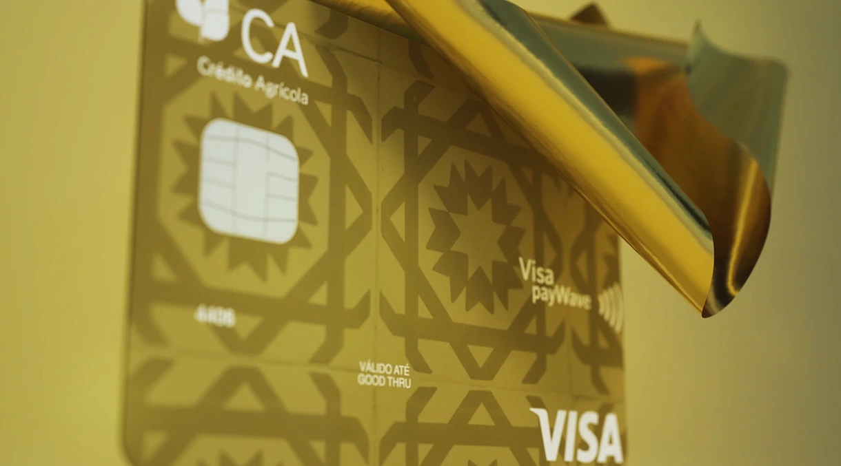
Premier is the top of the range, a gold card built around prestige and the kind of benefits that come out on a trip. So it lives in gold, in warm light and soft fabric, closer to a luxury product than a banking one.
The art direction for each film comes from what the card is and who it is for, not from a palette chosen to look good.
Premier is the top of the range, a gold card built around prestige and the kind of benefits that come out on a trip. So it lives in gold, in warm light and soft fabric, closer to a luxury product than a banking one.




Classic is the everyday card, the one meant to handle whatever the week brings without ever being the point. Silver, glass and cool reflections suit that better than shine does. Solid, clear, quietly modern, a classic rather than a statement.
Classic is the everyday card, the one meant to handle whatever the week brings without ever being the point. Silver, glass and cool reflections suit that better than shine does. Solid, clear, quietly modern, a classic rather than a statement.




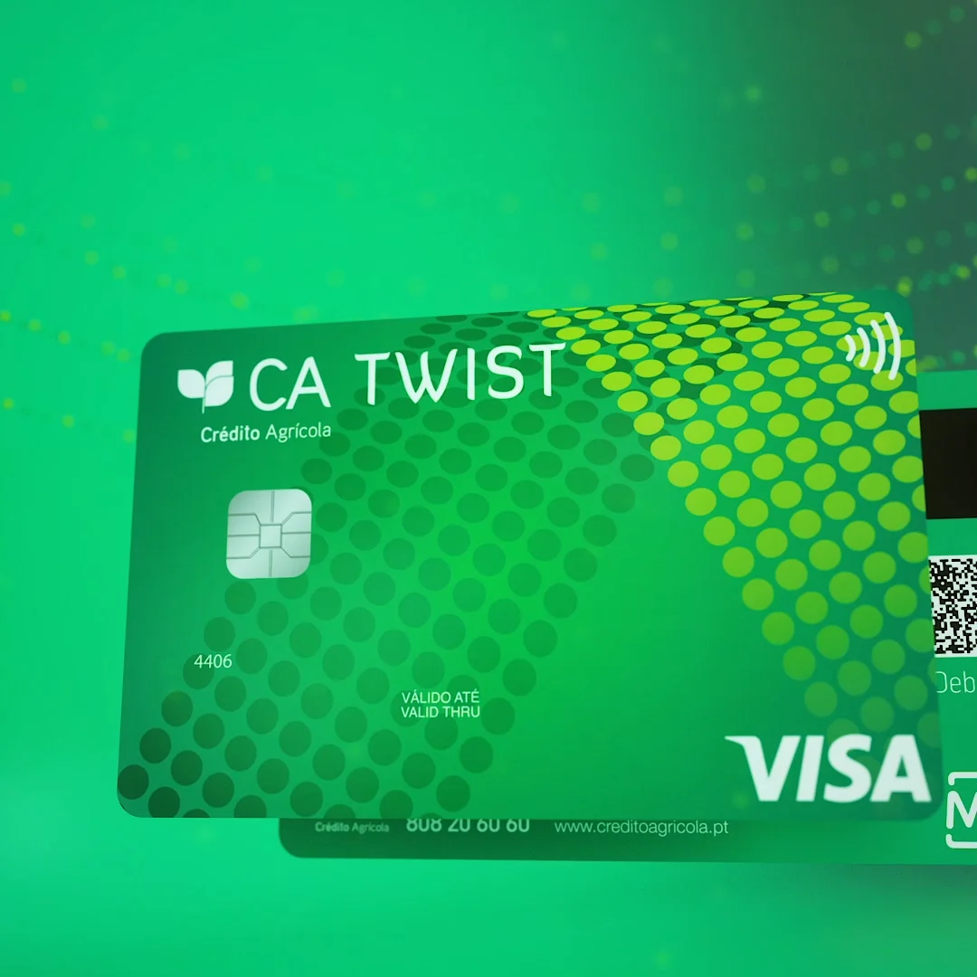
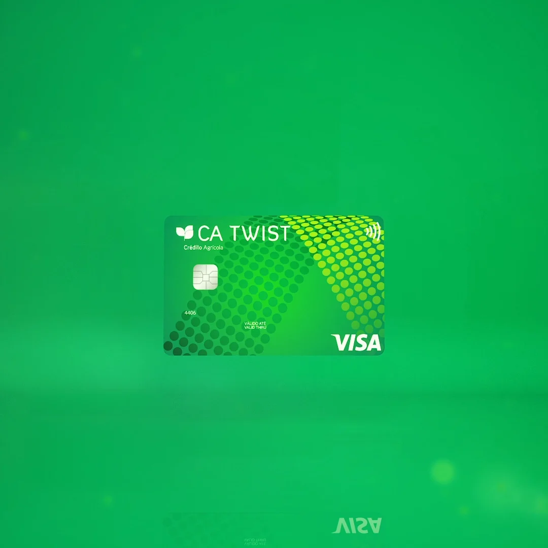
Twist let people choose at the moment of payment, debit or credit, which is the single thing that made it worth talking about. Two cards in the frame and forms that turn and fold say that faster than any line of copy could, and the name is doing the same work.
Twist let people choose at the moment of payment, debit or credit, which is the single thing that made it worth talking about. Two cards in the frame and forms that turn and fold say that faster than any line of copy could, and the name is doing the same work.


Three cards, three audiences, three films. One bank behind all of them.
Three cards, three audiences, three films. One bank behind all of them.



Credits
Year: 2023
Agency: Blue Pepper
Client: Crédito Agrícola
Creative & Art Direction: Filipe Cordeiro
Copywriting: Ana Silvestre, Daniela Carneiro
3D & Motion Design: Filipe Cordeiro
Digital Advertising: Raquel Araújo
Project Management: Daniela Carneiro
Sound Design: Filipe Cordeiro