APP LAUNCH CAMPAIGN


A Bola is one of Portugal’s most iconic sports media brands. But legacy alone doesn’t win the digital race.
Ringier Sports Media Group was launching a new A Bola app and needed a campaign to drive qualified downloads and registrations. In a saturated market where every competitor promises the same thing, a campaign built on features would disappear. We needed a different kind of reason to download.
We started with a simple observation: watching has become easy. Understanding has become rare. This was the territory. Not speed. Not volume. Not more noise. Depth, context, and the freedom to follow sport on your own terms.
The answer became the campaign concept:
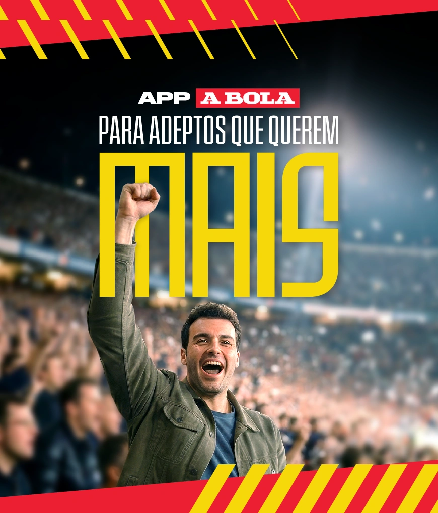
Para Adeptos que Querem Mais.
A Bola is one of Portugal’s most iconic sports media brands. But legacy alone doesn’t win the digital race.
Ringier Sports Media Group was launching a new A Bola app and needed a campaign to drive qualified downloads and registrations. In a saturated market where every competitor promises the same thing, a campaign built on features would disappear. We needed a different kind of reason to download.
We started with a simple observation: watching has become easy. Understanding has become rare. This was the territory. Not speed. Not volume. Not more noise. Depth, context, and the freedom to follow sport on your own terms.
The answer became the campaign concept:
Para Adeptos que Querem Mais.
The strategic answer was to stop competing on features altogether. “Para Adeptos que Querem Mais” isn’t a product claim. It’s a self-selection mechanism. The fans who identify with it are exactly the fans the app is built for: engaged, attentive, and willing to come back.
Two art direction decisions shaped the visual identity of the campaign from the start.
The strategic answer was to stop competing on features altogether. “Para Adeptos que Querem Mais” isn’t a product claim. It’s a self-selection mechanism. The fans who identify with it are exactly the fans the app is built for: engaged, attentive, and willing to come back.
Two art direction decisions shaped the visual identity of the campaign from the start.
The first was the logo treatment. A Bola’s masthead carries decades of editorial authority, and we wanted that weight to transfer directly into the campaign. The typographic system was built around a condensed, high-impact typeface that speaks the visual language of contemporary sports communication: bold, unapologetic, built for scale. Within that system, a single word does all the heavy lifting. “Mais” breaks from the rest of the headline in colour and scale, turning a campaign line into a declaration. It doesn’t just complete the sentence. It owns it.
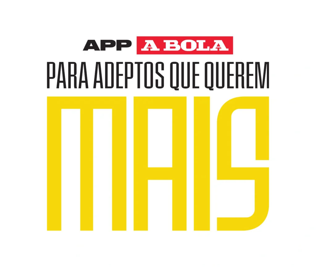
The first was the logo treatment. A Bola’s masthead carries decades of editorial authority, and we wanted that weight to transfer directly into the campaign. The typographic system was built around a condensed, high-impact typeface that speaks the visual language of contemporary sports communication: bold, unapologetic, built for scale. Within that system, a single word does all the heavy lifting. “Mais” breaks from the rest of the headline in colour and scale, turning a campaign line into a declaration. It doesn’t just complete the sentence. It owns it.

The second was the image direction. Rather than defaulting to action on the pitch, we centred the fan. Not the player, but the person watching. A deliberate shift in perspective that reinforced the core idea at every touchpoint: this campaign isn’t about the game. It’s about the person experiencing it.
The second was the image direction. Rather than defaulting to action on the pitch, we centred the fan. Not the player, but the person watching. A deliberate shift in perspective that reinforced the core idea at every touchpoint: this campaign isn’t about the game. It’s about the person experiencing it.
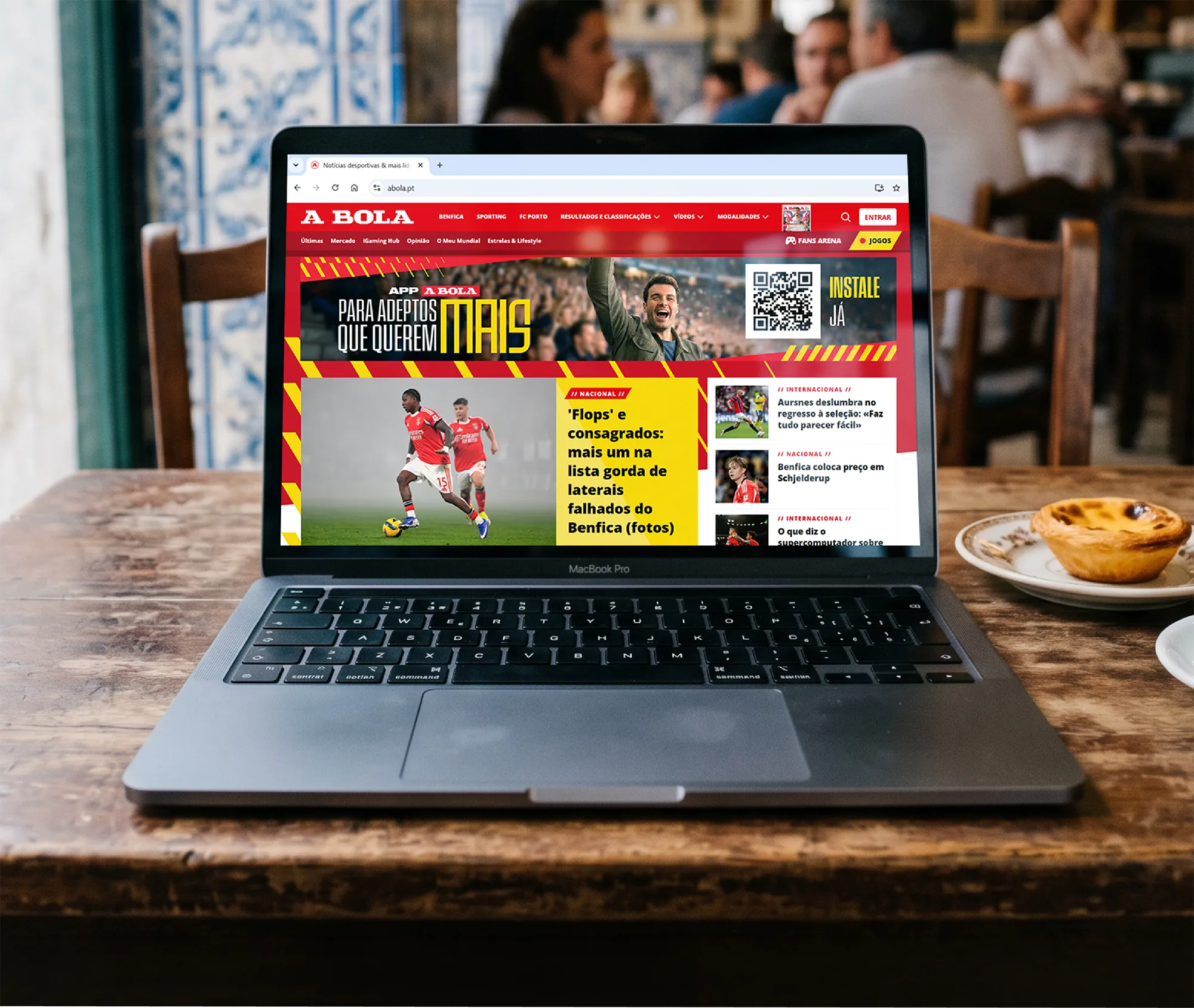
The campaign launched across print, digital, and social media, anchored by one concept, one voice, and one clear message to the right audience.
The campaign launched across print, digital, and social media, anchored by one concept, one voice, and one clear message to the right audience.


Skateboarding has always been a big influence in my life. It taught me to see the world through a creative, challenging, and playful lens — an attitude that still guides my work today. While completing my BA in Graphic Design and a 2D & 3D Animation course, I began my professional journey in 2013. Since then, I’ve worked both freelance and in-house, collaborating with global brands such as Google, Meta, Robinhood, NEOM, BMW, Vodafone, Casio, L’Oréal, Vans, Worten, and many more.

kateboarding has always been a big influence in my life. It taught me to see the world through a creative, challenging, and playful lens — an attitude that still guides my work today. While completing my BA in Graphic Design and a 2D & 3D Animation course, I began my professional journey in 2013. Since then, I’ve worked both freelance and in-house, collaborating with global brands such as Google, Meta, Robinhood, NEOM, BMW, Vodafone, Casio, L’Oréal, Vans, Worten, and many more.
Credits
Year: 2026
Agency: Blue Pepper, Media Gate
Client: A Bola
Concept & Strategy: Filipe Cordeiro, Djáli Campos
Creative & Art Direction: Filipe Cordeiro
Project Management: Djáli Campos
Graphic Design: Filipe Cordeiro
Copywriting: Djáli Campos
Digital Advertising: Media Gate